ExploreStation Workshop — the future of British railway stations

Well, it’s been a while since I wrote — so far in 2022 I’ve mostly been focussing on my freelance work (hire me 😉) and having some surgery which rendered me mostly out of action for a month or so.

I am still thinking about ways to pursue my research further in future, and was delighted to have the opportunity to get involved with an ‘ExploreStation’ workshop — the perfect chance to get my thinking cap on once again about the future of the UK’s railway network, and how its infrastructure impacts on the communities around it.

In fact, these workshops pretty perfectly hit upon the venn diagram of ‘Emma’s interests’, as they were also focussed around the notion of ‘co-design’ — allowing communities to play a part in the conception and design of the spaces they will be using.

About the workshops

So, back to the start. What are these workshops about and who are they organised by?

A few years ago, Network Rail (the body who manage and run the UK’s railway infrastructure), decided to embark on a scheme to radically re-envision how the UK’s small to medium sized stations (that’s four out of every five railway stations in the UK) are built and renovated.

At present there is little consistency in terms of the design and construction of these stations, which — I would argue — is part of their charm. However when it comes to long term maintainence, consistency of experience, and (though some would argue this matters less) overall brand integrity of the UK’s railways, the current approach leaves a lot to be desired. Not to mention the environmental impact of their buildings and construction.

Of course, a one-size-fits-all ‘new station template’ wouldn’t work either — stations are situated in very different spaces and locations. Some have architecturally important buildings which should be kept. Plus there isn’t the budget to ‘tear it down and start again’ on every small to medium sized station in the UK. What Network Rail want is a ‘kit of parts’ so that when aspects of a station need refreshing or replacing, it can be done in a consistent way.

They launched a competition for architects across the UK and around the world to enter, in which they were challenged to come up with a solution to these problems. In May 2021 it was announced that 7N Architects, who are based in Edinburgh, had won, with their ‘HUB’ station design proposal. You can read/see a bit more of this here.

One of 7N Architects mockups of the proposed station design

However, this wasn’t where the project ends. Network Rail commissioned the Design Council (A charity who are effectively the UK government’s advisors when it comes to any matters of design), The Glass House (A charity that supports organisations with involving the community in their design process), Digital Urban (who help build 3D models of places to give people a better understanding of spaces and places), and Commonplace (A ‘citizen engagement platform’) to figure out how best to involve the general public in developing these designs further.

At the heart of their quest for knowledge from us, the general public, was how these stations could become more than just conduits for getting on and off a train, and actually become vital community hubs, which sit at the heart of the places they connect. An interesting challenge given that not all of these stations actually are geographically at the heart of their locations, and that large swathes of the population rarely or never use the railway network!

These questions also tie into a lot of my research and thinking (particularly at the early stages of my MA project, like my ponderings of Clapham Junction station) around the potential of stations to be more than just stations. Suffice to say, I was super excited to take part in this series of workshops!

My ‘speculative futures’ approach to Clapham Junction station

The workshops so far have taken place in two phases. The first round (which I didn’t know about!) happened last November/December, and asked small groups to feedback on 7N’s initial design proposals. (As an aside, really pleased to see that these workshops have been run in cities across the country, NOT all, or indeed, at all in London!)

We weren’t privy to the detail that was gleaned from these workshops, but one thing which was mentioned were concerns about light pollution from the (previously very glowy) clock tower design, as well as feedback about the neccesity of toilets being situated outside the gateline, if they want these stations to become true community hubs. (Good feedback which I would agree with!)

With revisions made by 7N, these next workshops were designed to glean more feedback specifically about community use of the station spaces. I attended the third of three workshops in Brighton, on May 25th, 2022.

The workshop

The workshop was located at my old undergrad university campus — the University of Brighton’s ‘Grand Parade’ building. It was slightly strange to be back for the first time since my graduation in 2010!

All attendees were given a lovely brochure about the workshops and the station proposals, which I found very well thorough and well put together, and helpful to browse while we waited to start.

The last image above offers a good summary of what the early workshops identified as important in the HUB station design. These were that the station should:

  • support existing and new communities
  • understand and embody local character and heritage
  • provide consistent quality of space for service and passengers
  • establish connections between town centres and high streets
  • celebrate and improve the quality of green/open space
  • facilitate inclusive travel
  • support and better integrate model transport (by which I assume they mean buses and trams)
  • address climate change
  • ensure longevity (I assume this means ‘of the station facilities’, but if it can somehow help MY longevity too, then bonus 🙂

The workshop opened with a presentation of the proposals so far. I haven’t been able to find a thorough version of this online, but this design council article offers a reasonable summary.

The station proposals are, as mentioned, a ‘kit of parts’. This includes the area directly outside the station (described by them as the ‘welcome mat’, which I quite liked), the canopies over the platforms, as well as modular spaces allowing for all kinds of different applications, from station-related stuff like waiting rooms, toilets, ticket offices and staff space, through to more community minded stuff like shops, cafes, and other multi purpose spaces. A key part of the design is the iconic ‘clock tower’, which would make the station visible from farther afield, and is designed to lightly glow as trains pass.

I feel like this should be a space where I go hard on critique of the designs, but actually, for the most part, I felt really positive about them. I was impressed by their thoughtfulness around use of materials, and the ‘build less’ mindset. Much of the station would be constructed from wood, which is both more environmentally friendly than many other materials, and due to its lighter weight, reduces the need for large foundations (lots of concrete). I was also impressed that they offered an explanation of why they had NOT used some popular environmental choices like rainwater collection (actually less environmentally friendly due to energy used in pumping and space/energy used for storage) and green roofing (little actual positive environmental impact and uses up space that would be better used by solar panels).

The only downside of the ‘build less’ approach was that I (and a number of other workshop participants) shared concerns about the Great British weather — if these stations are to meaningfully become community hubs, they must offer sufficient shelter to offer comfort year round, not just in the balmier summer months that the visualisations appear to depict.

I was also impressed by the modularity of the systems — in settings where, for example, a station building is beautiful and historically valuable, the modern platform canopy design, clock tower and ‘welcome mat’ concoruse area could still be deployed around it, lending the station a feeling of consistency, while still not losing its unique local character. Another nice touch was for the clock towers to be constructed from local materials, so that they don’t feel out of keeping with their surroundings.

To round off that section of the workshop, we were asked a series of quick fire questions (and given a worksheet to answer them on), about whether we understood the plans, and whether we agreed with various aspects of them. It was a good way to give our feedback quickly, and in a way which didn’t allow any voices to dominate. (I am not a fan of workshops which rely on the ‘any volunteers to speak’ approach, as they can end up being over-long and often don’t allow a range of voices to be heard.)

But what about the teens

The second half of the workshop saw us divided into small groups of four or five, and asked to consider one particular area of the station in detail — and how that area could be used by the community. We were given the ‘welcome mat’. We initially pursued two areas of interest. The first, somewhat predictably, was community gardening, which feels like a big buzzword (/buzz idea?) at the moment. And with good reason — gardening is a wonderful collective activity which offers rewards for both participants and the environment. However, so often these sorts of schemes are hatched with little thought to their long term maintainence, or how community dynamics will actually work in practice. The most successful community gardening schemes tend to be those initiated and run by communities themselves, rather than those launched upon communities from on high. (I have been doing some pondering/work around this under one of my other professional hats, which I may write more about here soon!)

The other idea we discussed was space for teenagers. Railway stations and other transit hubs have often been spaces where young people congregate, due to their freedom of entry, provision (sometimes) of facilities like toilets and benches, and their often mostly un/under supervised nature. This use isn’t without its problems. Large groups of teenagers can be intimidating for other users of stations, and they do, at times, fail to treat said communal facilities with respect. We wanted to ask the question of how a space could be created that welcomes teenagers, offers them comfort, safety, and a space to be themselves, while also not jeopradising the other uses of the station and its surrounding spaces.

After discussing these ideas for 15 minutes or so, we were provided with an exciting and somewhat unexpected collection of art supplies, and asked to pick one of our ideas and visualise it. We opted for the space for young people (and I’m glad we did, as I think three of the other groups went for some variation on community gardens!)

We only had 15 minutes to put together our final vision, which quite obviously wasn’t long enough to do anything justice, but we tried our best.

We rather trendily called our concept the ‘teen hub’ (I’m sure the teens will come flocking with a cool name like that), and used our large sheet to discuss a number of ideas.

  1. What kind of space would feel comfortable for young people to spend time in? We settled on the idea of a stepped outdoor theatre style space, which has the added bonus that it could occasionally be requisitioned for community performances. But most of the time, it just offers a seated, slightly sheltered from the wind space with lots of different areas and aspects for groups of teenagers to mingle in. (The white dough was my attempt at an outdoor stepped theatre but it kind of looks like creepy teeth…)
  2. We were keen on the idea that this space be overlooked, but not observed. Some way of offering young people a space of their own, where they feel able to relax and socialise, but also not a totally lawless area. One of our group suggested further shelter/seclusion be provided by Mashrabiya style screens, a feature of middle eastern/islamic architecture which offers both privacy and visibility all at once. (The red dough was one of the other group members attempt as a mashrabiya)
  3. We felt that it was important that the welcome mat area didn’t become a space ONLY for young people. We pondered on the idea of other events frequently happening adjacent to the stepped theatre area, like farmers markets, pop up vendors, and in smaller communities, that this could be the space where the library van, bank van, blood donation van etc. pitch up. This would ensure a constant flow of people around the space, while the mashrabiyas and lowered seating area would still offer the teenagers the degree of privacy and seclusion which they want.
  4. Of course everyone knows you can’t just say to teenagers ‘this is your space, use it’. We discussed what other incentives (beyond simply creating a space which hopefully offers a desirable seating/sociability format) would be needed to persuede ‘the kids’ that this was where they wanted to be. Perhaps the youngest member of our group (I’d guess a man in his mid twenties) emphastically said ‘bubble tea’. I also suggested ice cream. The conclusion was, venues selling cheap, tasty teenage treats, that are non-alcohol focussed and stay open late. Bubble tea, Ice Cream, whatever it might be. Capitalism is none of our friend, but when thinking about the existing frameworks we live in, offering desirable goodies for sale with long hours and relatively cheap prices, seems like a tantalising prospect for building community spaces which include all ages of the community, not just adults.
  5. Of course, while there might be shops/cafes and other spendy places, at the heart of a community space should be FREE amenities. These would include toilets, a water fountain, and we also did touch on surrounding the lowered seating with fragrant but hardy plants, some of which would be forageable.

Of course, in the time we had, our plans couldn’t possibly address all questions/concerns. Our space is still open to rainfall, even if it does try and be a little sheltered from the wind. Is that good enough? Does taking things under cover raise other issues around access and safety? Who maintains the fragrant planting? Is it network rail, or the community? If stations aren’t at the centre of their locations, how do you persuede your bubble tea vendor that this is a good place to set up shop? (We did discuss all retail being on a pop up basis to start with, with regular schedules, so that, e.g. ‘Friday night until late is Bubble tea night’). Plus loads more questions beside.

But it was good to try and tackle a tricky issue — as someone who grew up in a rural area where transit hubs were absolutely social spaces for teenagers, and often not in a particularly positive or healthy way, how could this situation be turned on its head? When thinking about these new small-to-medium stations as community hubs, it’s vital that they are for ALL of the community, not just middle class white people aged 25 – 45. Our attempt to address the 12 – 18 demographic felt like an interesting challenge, though of course, as a bunch of adults, we are falling into the trap I’ve criticised, of attempting to design for those not ourselves. A meaningful consultation/idea generation session on this idea would include not just 12 – 18 year tolds, but 12 – 18 year olds from the specific community where the plans were being discussed.

All of the groups presented their proposals, and (though there were a number of community gardens), it was exciting to hear how different people had thought things through. (and with much better use of pipecleaners than us). These workshops were directly facilitated by The Glass House, who recorded our little mini presentations, and collected all of our worksheets and concepts afterwards, and will presumably be back in their glass house (?) wrangling all of this (and the other workshops) into some kind of presentation to 7N and Network Rail in a few months time.

Afterthoughts

Overall I really enjoyed the workshop. I am glad that Network Rail have decided to try and consult more widely than just within the design/architecture community, and other ‘experts’. The challenge, of course, is engaging with communities who maybe wouldn’t come to hear about these workshops. (Like for example, the 12 – 18 year olds we were attempting to design for). I am not sure how they were promoted (I heard about them via a design council person I follow on Twitter), but the issue is that they will always be inherently self-selecting. From what I could tell, most people who came were either transit nerds, design nerds or both (me). How can we ask these kinds of questions of people who are none of these things? People who might think they’re not interested in public transit at all?

I was really impressed by the Glass House’s overall approach, and do feel sure that they are asking these questions of themselves and their collaborators too.

I’m excited to see where this project goes next, and hoping I can find other ways to be involved!

What next?

What next for me?

Well, the MA is over, and I got a Merit for my labours! There were times last year where I thought I didn’t even have the smarts to make it through an MA at all, so this is definitely cause for celebration.

So now it falls to me to ask the scary question — what’s next? For me, for my life, my research? Entering into this MA I didn’t necessarily think of myself as a ‘researcher practitioner’, and it would be very easy to fall back into a life where research doesn’t play a huge role in my practice.

Most of my professional work will probably remain unchanged from where it was at pre-MA. As a freelance designer with a relatively well established base of clients, I do a lot of creative artworking… I also design logos and brand worlds, which certainly require a degree of research, as does my illustration work, sometimes. But not the kind of scholarly, methodical, methodological research that I have started dabbling in on MAGMD. 

It’s fair to say there was something of a void in my practice before I started this MA, and there will probably continue to be something of a void if I simply stop thinking in these ways and considering ideas more deeply. So now it befalls me to find ways of taking this work forward, without the structures and framework of an academic qualification to push me forward. (Because goodness knows, I’m not doing a PhD any time soon).

What next for my area of research?

When we were defining our major project area, our tutors were at pains to emphasise how much we must care about and be invested in our area of study. ‘If you’re going to think about this thing for six months straight and produce good work about it, it needs to be something that compels you’. 

Well, I picked the thing that I’ve wanted an excuse to think about in more depth for years, and I’m pleased to say that I have reached the end of this process still fascinated by it, and crucially, with the feeling that there is so much more to explore. 

It took me much of the last decade to come to peace with my identity as a train nerd, not least because I didn’t feel I fitted in with the Francis Bourgeois’ and Fred Dibnahs’ of this world. Mechanics and models of train don’t hold loads of interest for me, beyond the functionality they serve to humans in transit (so I am interested in, for example, the different layouts of the interiors of different kinds of train). 

What I care about, and what has fascinated me all these years is what trains mean, what they stand for. Their nature as an inherently communal space, a way in which individual needs and desires intersect in shared purpose. What is the experience of train travel? How does that experience differ from person to person? How do our individual ideas and experiences of train travel build into a collective mood and vision that shapes what we want and what we expect from our transit networks?

When I think about the future of this country, and the world, there are ever so many vital, pressing areas which seem to need thought and passion and change. Another thing I wrestled with for a long time was that my area of interest wasn’t important enough. Why am I over here fucking about making posters about trains when the oceans are rising? But everything is a piece in the puzzle, and it is my firm belief that the expansion of public transport provision and use globally is a vital piece in this puzzle — a puzzle which we absolutely must solve.

So then I ask myself — what difference can I make? I’m not a policy maker — if I was, I’d be reversing as many of the Beeching cuts as possible, building other new lines, massively investing in high speed rail and in developing and improving the network and rolling stock we already have, and ultimately striving to make public transport free for all. But this is beyond my will, and probably beyond the will of anyone in this country right now.

So instead, as a graphic design researcher-practitioner, I ask myself how I can use my skills to explore what rail travel looks like right now, what it means, and to advocate for, and ask questions about, its future growth and improvement, as well as sowing the seed in the minds of others about its importance.

What next for my MA project?

Of course, I have already made a big start on this work with my MA project, LDN – BTN, which takes an in-depth exploration of a whole range of facets of the London to Brighton railway line as a starting point for asking wider questions about the future of railway travel in the UK (and beyond). The work that I have produced so far could be considered ‘Phase 1’ of the project.

This ‘Phase 1’ has involved a degree of collaboration — with my 12+ walking companions/contributors, as well as a number of other people who have advised and supported me in my work. But for this project to develop further and take on wider significance, I need to figure out where to take it next. What is ‘phase 2’? There are a few avenues I want to pursue.

1) Distributing physical copies

I have a total of 30 full copies of the project. It was expensive and a labour of love to produce, as documented, so this is likely all there will ever be. Approximately 18 of them have homes with my contributors and others who have supported me in my work, but I want the remaining 12 to live in collections or spaces where they will be accessible to as many people as possible, and also archived for posterity. (There’s a little vanity in this of course, but it also seems like a natural conclusion to ‘Phase 1’ to make the project as it currently stands more widely accessible in its physical form)

2) Seeking wider contributions

My original vision for the project was to seek out much wider contributions from people beyond my immediate circles, but COVID and timeframes made this impossible. However I still feel like it is an important part of the project to strive to get this wider participation, so the key part of ‘phase 2’ is to try and find ways of meaningfully seeking this out. There are many groups of people who I would be interested in engaging, including train staff, children and young people who travel by train, commuters, leisure travellers and more.

I am interested in the idea of running workshops in a variety of different settings, using the tickets I have already created as a provocation. What stories can be told by other people using these tickets as prompts? How can I use what I have learnt about speculative futures practices to draw out their best ideas? For the tickets where I have considered questions and drawn my own ideas, how might others answer these questions in their own way? Could the tickets be ‘gamified’ in some way to offer a different kind of provocation/working method for workshop participants? In my work I created a small set of 12 train tickets for each walk, contained within a ticket wallet. I like the idea of offering up this format to participants as a space to explore their own ideas about the route, and train travel more generally. 

3) Seek out external support/interest

None of the above is likely to be very successful without the support of some external parties. There are a number of organisations who I would like to approach with my project as it currently stands to discuss how we might be able to collaborate to take it further. These include:

Southern Rail/Thameslink — Could I get permission to spend time in their stations conducting this one-to-one/group research when COVID pressures are less intense? Could I even run, for example, a short residency in a station? Some smaller stations have old waiting rooms and other station buildings that are sometimes given over to art projects — what could be more fitting than using those spaces to welcome train passengers and invite them to contribute to this project?

London Transport Museum — My project has a massive overlap with the kind of work the LTM does in fostering an appreciation and respect for the railway network. What guidance, support, and at a stretch, space, could they offer me in pursuing this more participatory approach to my research?

4) Document these contributions meaningfully

If I am successful in running workshops and/or in seeking out further contributions in other ways, what do these ideas become? How are they shared? How do they feed back to places and people who would benefit from seeing them? Engaging external partners will also be a key part of this process, in figuring out how this research can do the most possible.

What next for other projects?

LDN – BTN is likely to occupy my attention for some time to come then, but it was always created with other ideas for taking this research further in different settings.

‘Up North’

In the UK, the railway network is notorious for having something of a North-South divide. While commuters in the south complain about over-crowded carriages and delays, somehow the voices of commuters in the north, who suffer from — often — even worse over crowding, older trains, and worse delays, are rarely heard south of Manchester. As part of the UK’s fight to combat climate change, it is vital that investment be made in railway networks across the country. It is also vital that more rural areas be equally considered in this investment. I don’t yet have a well formed idea of what this study would look like, but I am interested in taking similar research methodologies to those used in LDN – BTN, to explore perceptions of the North-South divide in railway travel, rural experiences of rail connectivity (both into cities and surrounding rural areas), and how rail travel as a whole is understood in areas towards the north of the country, both by those who do and do not use it.

Eurostar

Another project I proposed in the early stages of my MA planning was a study of the Eurostar network. Eurostar, at the time I was beginning my project, sat at a strange precipice — the combination of Brexit and COVID had left it precarious and vulnerable, and there were, for a time, questions about whether a passenger rail connection between the UK and mainland Europe might lapse. Its future now seems more secure, but there are still a lot of interesting questions to be asked about rail travel between the UK and EU. I have long been fascinated by how sense of place manifests itself in the liminal spaces we pass through during transit…. High speed international rail should offer a vital alternative to air travel, but many people do not consider it as an option. Why is this? Could fostering more of a sense of place, history, and excitement about the very physical process of moving across large landmasses at speed, at ground level, contribute to increased affection for, and uptake of this mode of transport? Do Europeans need as much convincing of this as British people? Through an in-depth study of Eurostar termini and stations in London, Paris, Brussels, Lille and Amsterdam, what could we learn about the spaces that have been created, the meaning they carry for those who pass through them, and what this means for uptake of long-distance, high-speed rail into Europe?

The USA

I have long been fascinated with rail travel in the US, and there are a whole variety of areas I would be fascinated to turn my attentions to. Long-distance rail travel in the US is an incredible and often under-used resource, with many Americans never even having travelled by train. Amtrak also have a history of supporting artists in residence and art projects about and across their network, which makes this feel like fertile ground for study.

Los Angeles is a city very close to my heart, and before travelling there, I was widely informed that I wouldn’t get anywhere without a car. In practice, this isn’t entirely true. While offering sparse coverage, there is a metro network which connects many key areas of the city. However, many native Angelenos have never even set foot on it (find a Londoner who’s never ridden the underground!) — it is perceived as slow and dangerous. Where does the network pass through, who uses it and why, and how might it be seen and understood differently? 

New York is perhaps one of the US cities best served for public transit, and yet getting from the main airport to the heart of Manhattan via public transport is a lesson in confusion and strife. Here, as in LA, I am interested particularly in the approach I adopted in LDN – BTN, of exploring a route both on foot and by train, to come to a richer and deeper understanding of the people and the spaces created by the network, and how they might be better appreciated and supported.

Japan

Image from https://www.tripzilla.com/jr-east-pass-themed-trains/84127

Japan is widely known for having some of the best and most reliable trains in the world. Perhaps best known are its Shinkansen (Bullet) trains, but beyond this there is a vast network of smaller branch trains, many with incredibly idiosyncratic designs and concepts, purpose made to lure in tourists. While there are a number of unique and unusual trains dotted across the world, nowhere is there such a proliferation of these ‘concept’ trains as in Japan. By exploring a number of these branch routes, both from the train and the stations, what can we learn about the ways trains are perceived and valued in Japan, and is there any way of introducing this ‘culture’ in the UK?

What next for this blog

What next is I stop writing, and thank you for reading this far. If you have any thoughts or ideas about any of this, please drop me a line, as I’m keen to discuss my next steps with some fresh ears. I will write some more when I’ve started making a bit more progress!

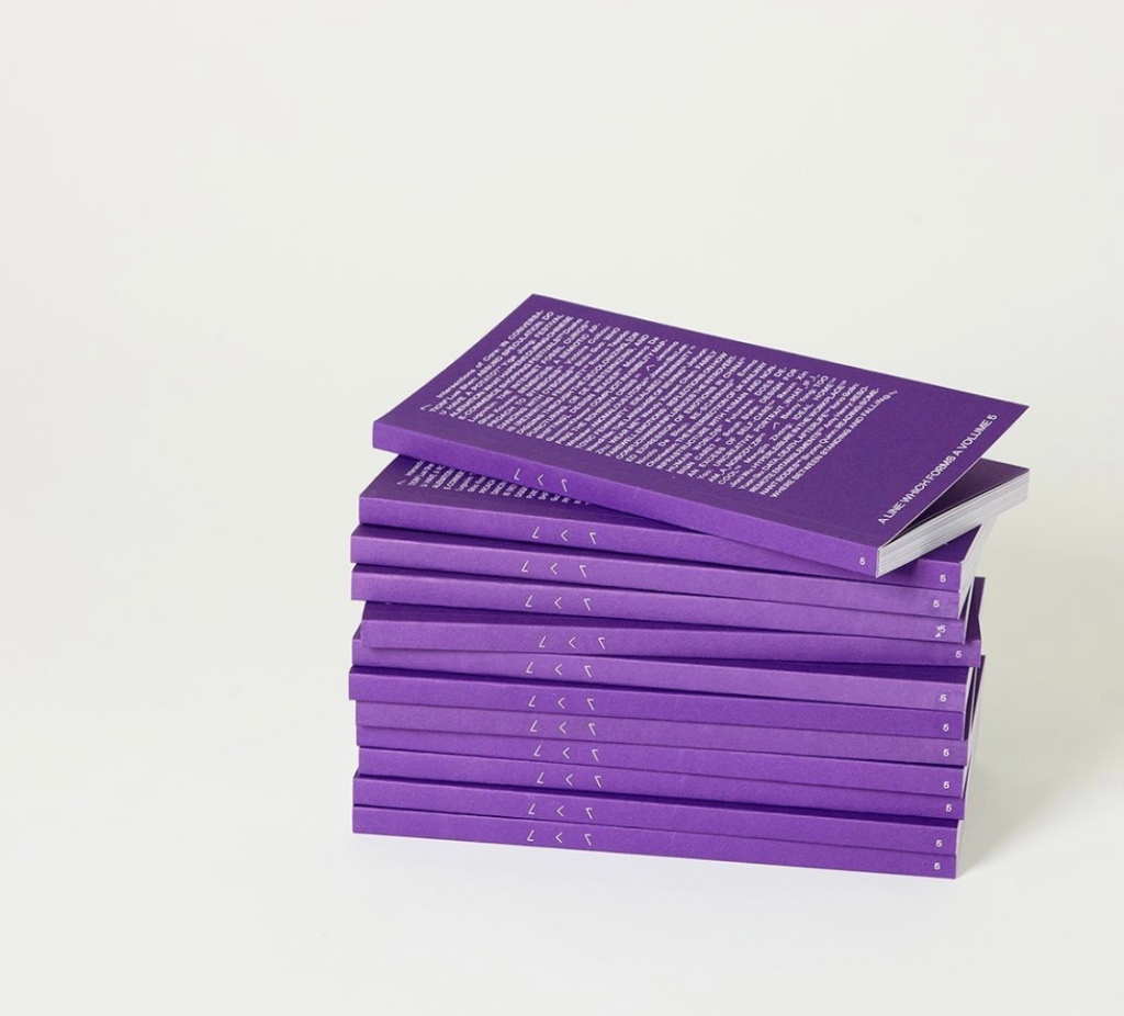
A Line Which Forms a Volume

Image by Victoire Colliou

Each year, the MA Graphic Media Design cohort publish a book of critical design writing, forming part of a series called ‘A Line Which Forms a Volume’. The publication is made up of contributions from some members of the course, as well as external contributors. A group of students curated, edited and designed the entire thing to a scarily short deadline (of which I was not one — I had more than enough on my plate with trying to hold down work alongside the course!) — the final outcome is, as always, very impressive (if a little dense in places…)

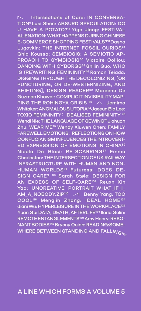
I was delighted to be selected a one of the contributors, after pitching a place about the co-existence of human and non-human worlds in the context of railway infrastructure.

The theme of this year’s ALWFAV is ‘Leaning’, and structures of care. Taken from the formal descriptive text written by the curators:

“ALWFAV 5 explores how the act of leaning on, with and into a research topic can be regarded as a form of care for the complexities of contemporary society. We ask: ‘Who are we, and who do we care for?’
Bringing together contributions from Bryony Quinn, Intersections of Care, Futuress, Ramon Tejada and the MA GMD participants who share their emergent design research, ALWFAV 5 approaches the idea of leaning from a particular perspective—the encounter between care and radical transparency in design research. By using graphic design as a critical tool for investigation and divulgation, we build physical and conceptual support structures that provide publics with a route into the research areas we contribute to.
The publication […] offers space for our contributors to share how their design practice correlates with the notions of leaning through care and radical transparency.”

I am pleased to share my piece for the book in full below.

The intersection of UK railway infrastructure with human and non-human worlds


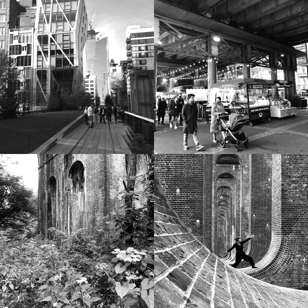
Clockwise from top left: New York’s High Line Park /  Borough Market, which is situated around and underneath railway lines near London Bridge / The Ouse Valley Viaduct, rural railway infrastructure which is frequently visited as instagrammable artefact / A less visited viaduct near Burgess Hill which has been claimed by nature

Across the UK run many complex networks of infrastructure, but perhaps one of the most visible and physically spacious is that of our railways. It intersects with countless communities and neighbourhoods, both dividing and connecting, as viaducts, cuttings, bridges, arches, tunnels, and station buildings sprawl across our cities and countryside. Yet for many people, despite their scale, these structures tend to fade into the background of their day-to-day experience.

During the 19th century when the railways first started to spread across the UK, competing providers raced to secure the best routes across the country, particularly into London, resulting in a dense web of structures (especially south of the Thames) which have left a lasting mark on the access, layout and function of the neighbourhoods which they pass through.[1]

There is now a huge range of human activity beyond the direct operation of the railways which leans on the infrastructure of the network. Throughout the UK there are approximately 5,200 railway arches which play host to businesses of all kinds. [2] Railway stations are also home to many small and large companies — often food and drink outlets, but with countless other more creative examples, like the Green Door Store music venue in Brighton which sits in the bowels of the station’s sloping underground areas, or the tiny ‘Northern line’ antiques store on the quaint platforms of Knaresborough station, in Yorkshire.

And these are just examples which make use of still-functional infrastructure. When railways and their surrounding facilities have fallen into disuse, what’s left behind is often repurposed for alternative human needs — one of the most famous examples of this is New York’s much-loved [3] High Line park, which runs along a disused railway line and offers striking views across the downtown Manhattan streets it passes over. There are plans to recreate a similar scheme in London with the upcoming Camden High line. Nearby in Chalk Farm, an old train turntable building has been transformed into the iconic ‘Roundhouse’ cultural venue. Even when disused railways are left to totally crumble, the spaces they leave behind can be highly functional, due to their straight ‘as the crow flies’ routes, with former railway routes often transformed into footpaths or cycle lanes. [4] 

In my research I have been following the London to Brighton railway line, and exploring the past, present and future of the route, the connections it fosters between these two diverse cities, and the spaces it creates and comes into contact with as it travels. [5]

I often found myself imagining potential uses for disused or under-utilised spaces formed by railway infrastructure from my own perspective as a designer and urbanist. I was initially tending to approach them from a very human-centric, capitalistic focus, even where I thought that I was striving to push back against such ideas. (A pop up market of independent traders is still a capitalist notion, albeit one which prioritises small business over big).

Faced with the challenges of a rapidly changing climate and uncertain urban futures, what would it mean to step even further away from our human-centred perspectives of space, particularly in urban conurbations? How could we creatively show care for these void spaces we have created in ways that move beyond human needs? In coming to an understanding of place and space from a non-anthropocentric perspective, we can even further recognise the value of our railway infrastructure network as a support structure for both human and non-human needs, growth and life. (‘Non-human’ sometimes considers robotics and AI, but for the purposes of this piece refers to the non-human in the natural world [6])

Heightened uptake of public transit is an essential tool in our fight against climate change — this is the clear headline. However, it is also crucial to recognise the value of the wildlife corridors which are formed by railway lines — albeit ones which are controlled and managed by Network Rail to facilitate the clear and smooth movement of trains, but nonetheless, wild spaces of vital importance, and home to an incredibly diverse variety of our non-human neighbours. 

Still, I often see empty spaces created by railway infrastructure as filled with potential for human activity. But I continue to try and ask — how can we create spaces that expand past the imagination of what might please or help humans alone? How can we foster the creation of non-anthropocentric worlds of varying scales and varieties which cease to put capitalist human ideas first? In coming years the balance between human and non-human needs may become increasingly fraught, as our changing climate causes global migration of both people and animals [7]. But by acting now, and by acting with imagination, care and mindfulness, the spaces created along our railway corridors may be a small but crucial contribution to salvation for all of us, and a more balanced, thriving existence between neighbours of all kinds.

  1. Jenkins, S. (2021) (p.20) Britain’s 100 Best Railway Stations. Reprint edition. London, UK: Penguin.
  2. The Arch Co (no date) The Arch Company. Available at: https://www.thearchco.com/ (Accessed: 4 August 2021).
  3. Higgins, A. (2014) New York’s High Line: Why the floating promenade is so popular – The Washington Post, Washington Post. Available at: https://www.washingtonpost.com/local/new-yorks-high-line-why-the-floating-promenade-is-so-popular/2014/11/30/6f3e30cc-5e20-11e4-8b9e-2ccdac31a031_story.html (Accessed: 4 August 2021)
  4. ‘Our History | Railway Paths | public routes, roads and paths suitable for cycling, walking, horseriding and wheel-chair use’ (no date). Available at: https://www.railwaypaths.org.uk/our-history/ (Accessed: 12 May 2021)
  5. Charleston, E. (2021) LDN – BTN. Available at: https://ldn2btn.uk/ (Accessed: 24 October 2021).
  6. Nonhuman Rights Project (no date). Available at: https://www.nonhumanrights.org/ (Accessed: 24 October 2021).
  7. Anderson, B. (2021) (de)Bordering the human and non-human worlds – Migration Mobilities Bristol. Available at: https://migration.bristol.ac.uk/2021/06/08/debordering-the-human-and-non-human-worlds/ (Accessed: 24 October 2021).

The final piece

The previous two blogs documented the design and production of my final MA outcome.

LDN – BTN is a collection of 144 train ticket sized artefacts exploring the past, present and future of the London to Brighton railway line and its surrounding areas, as viewed from both train and on-foot.

Across twelve individual walks spanning the length of the route, twelve different themes are investigated and documented. The tickets are presented physically and digitally, allowing viewers to explore their own routes through the project. 

During the pandemic, we experienced a radical shift in our perceptions and experiences of public space and public transit, and how they are shared and used. As we enter a new post-pandemic era, what have we learnt about our expectations of public space, and our ability to travel collectively? LDN – BTN takes the specific focus of the London to Brighton railway route as a space to explore these questions from a wide range of perspectives.

LDN – BTN is informed by the work of placemakers, urban planners, anthropologists, visual diarists, flaneurs (and flaneuses) throughout history. It works with elements from across these practices, and documents them via the mediums of graphic design and illustration. The flaneur’s unplanned wandering and spontaneous inspirations intersect with the anthropologist’s detailed fieldwork, ethnographic case-studies and oral histories. The urban planner’s intricate understanding of human movement through public space intersects with the visual diarist’s rapid, in-the-moment, illustrated observations. Through experimenting with these methodologies, LDN – BTN presents a rich portrait of movement through time as well as place, on foot and by train, along this vital UK railway corridor.

The project’s online home is at ldn2btn.uk, you can also see more detailed documentation of the project at the UAL postgraduate showcase (mostly just what you’ve already seen on this blog, though!)

If you’re interested, you can also see the work of my fellow MA Graphic Media Design participants here.

Producing the tickets

Once all my tickets were designed, I started looking to production. It became apparent quite quickly that riso printing the tickets would not be viable, for a number of reasons.

1) When inputting data through the riso platen, reproduction of images was poor in terms of contrast (see pics), and given that so many of my tickets were photos or other images that needed contrast nuance, it just wasn’t good enough. Sadly, the USB input to the MAGMD riso machine was out of action at that time, which meant I couldn’t use that machine, so wouldn’t have access to the whole gamut of colours (I would only have access to the colours up at print and finishing).

2) To add insult to injury, one of the two print and finishing riso machines was also broken, with uncertain repair schedule, further limiting my colour selections, as the remaining machine only ran an even more limited number of colours. 

I couldn’t afford to go outside of LCC to get the project riso printed, so needed to consider other options, as printing in 12 colours had become quite an integral part of the project.

I went to talk with the technicians in Print and Finishing about the best way forward. At that stage it was quite hard to get across the fullest extent of my project, as not all my ticket artworks were yet finalised. 

It was suggested that potentially I could use the smaller litho press, given that my prints were single colour and likely all of each colour would fit onto a single plate. Still, it was emphasised to me that  this would be a very time consuming process, and may be challenging to fit around inductions for undergraduate students. 

We also discussed digital print as an option, which I was initially reluctant to pursue, as it felt a bit like taking the ‘craft’ out of the process — something which I had, on venturing into this course — been really excited to embrace. Do I really just wanna tell a computer what to do, like I do every other damn day of my job? I also felt that the vibrancy of colour would be severely lost in digital print, as opposed to riso or litho.

But ultimately… that was what it came down to. I simply didn’t have the time to litho these pieces (mostly due to my other freelance commitments, but also due to the potential pressures of accessing the LCC space in conflict with inductions), riso wasn’t going to work either, and so the only option that remained to me was digital.

In trying to make my decision about print process, I consulted with a number of people I respect, both on my course and design colleagues from outside LCC. What ultimately swayed it for me was a reminder from my former senior designer that Gemini Print — a Brighton based printing company that both of us have worked with for over a decade — have an extremely sophisticated and vibrant digital press that probably would do the project justice.

Cut scene to MANY HOURS of re-preparing the artwork in a totally different way for this different print process, and then to a large amount of money disappearing from my bank account.

But this did end up being the best approach — the quality and finish of the digitally printed tickets is excellent.

However, this didn’t mean that all the work was now done. I only paid to get the pieces printed flat. I had decided to produce 30 full sets, on the basis that this would mean I could distribute one to each of my 15 walking companions, as well as offer a few for sale, and distribute to a few well-respected zine libraries around the country.

This meant that I still needed to work in print and finishing to:

Round all corners (144 tickets x 30 sets x 4 corners per ticket = 17,280 corners)

Fold and saddle stitch all zines (6 zines x 30 sets = 690 folds, 180 staples)

Fold all ‘map’ tickets (12 maps x 3 folds per map x 30 sets = 1080 folds)

Fold all other foldable tickets (16 folds to be made x 30 sets = 480 folds)

This took… a while.

Once all my sets of 144 tickets were done, I needed to consider how to present them. A stack of 144 small pieces of paper is quite ungainly, so clearly, an easier way of navigating and exploring them was needed.

I considered a number of options, including:

Custom making a little ‘index card’ style box to enable them to be flipped through with fingertips and pulled out.

Some kind of folder (a bit like a photo album) with wallets for the tickets to slot into, enabling their fronts to easily be browsed and pulled out to unfold/view in more detail.

I also (earlier in the process) considered printing just one set of tickets, photographing them nicely, and then publishing them in a book format instead.

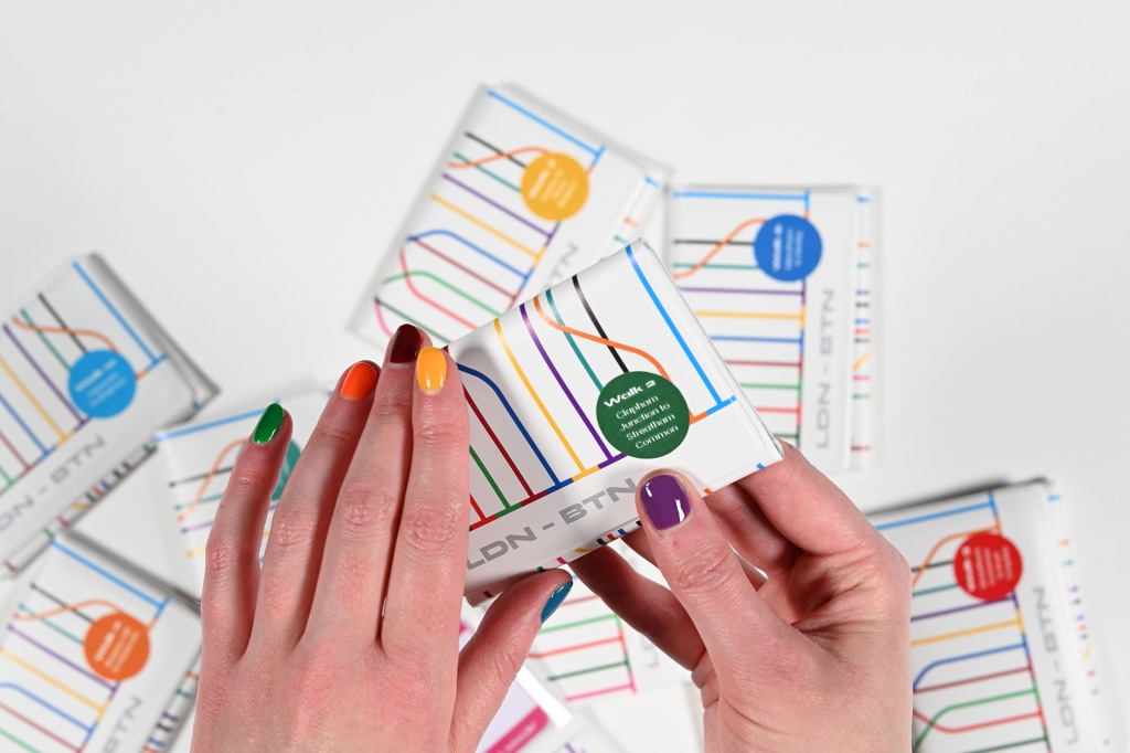
But ultimately, the idea which excited me the most (and other people I spoke to) was the idea of ticket wallets. The plastic ones that are given out at train stations when you buy a railcard or lots of train tickets, that unfold into three parts, each with a clear plastic section to hold tickets. 

I would get some of these especially made with a design of my own, and store each walk’s worth of tickets in one wallet — so the final outcome would be 12 wallets, each containing 12 tickets. The design reflected commonly seen diagrammatic train maps, and the interweaving of the 12 themes as explored along the route.

I got some custom made stickers to apply to each wallet, to make clear which walk was which. 

My only reservation about this idea was the amount of plastic involved in their production, but sadly I couldn’t find any sustainable versions of this product in any branded product stores, and reason that at least these (hopefully) aren’t destined for the bin too fast, as they are a long-term storage solution for the project. 

Other bits…

I knew that as well as the physical manifestation of the tickets, I wanted to create a way for them to be explored digitally. Both because I wanted the project to have a wider audience than just those who could hold the tickets in their hands, and because I felt that creating the right kind of website to house them could offer more powerful ways of exploring the project through filters by theme, so that people could hone in on the aspects they were interested in with more efficiency. 

I spent a long time trying to figure out how best to create such a website, given that I am not a web developer. Was there an off the shelf solution that would suit me?

After a few weeks such pondering, I realised I actually already had the perfect website sitting right under my nose — a bespoke system I commissioned a friend to make for me several years ago, for my personal freelance promotional website, which actually (with a few tweaks) would offer everything I needed. Luckily, that friend was amenable to helping me make the tweaks needed for this new website, so we were all set!

It took quite a long time to upload all the tickets, but once they were live, most of the website work was done.

The website also features an ‘about’ page which goes into more detail about the project and its individual themes.

Through creating the ‘about’ page on the website, I realised that the physical project was missing one vital element — some kind of user-friendly summary of the project’s aims and goals, as well as an explanation of each of the 12 themes — a ‘key’ of sorts, to the colour coding.

I decided to create this as a simple fold-out leaflet to accompany the 12 ticket wallets, in style lightly emulating a train timetable. 

The fold pattern of the paper means that the opening section (‘About the project’) is read as though reading a booklet, and then when unfolded, the ‘key’ text to the themes is viewed on one page. 

Overall I am really pleased with what I have produced. There are a few caveats to this though:

1) This project was wildly expensive  and fiddly to produce. There’s a reason no one publishes in this format! Had I opted for just flat tickets, it would have been a lot easier. Had I opted for publishing it as a book it would have been simple. But as an experimental, conceptual piece, I think it was overall worthwhile to explore in this way.

2) There are of course some things I would change in retrospect. One of the main ones is that I would add a small number somewhere in the design of each ticket so that people could more easily remove them from the wallets and know where they go back again afterwards.

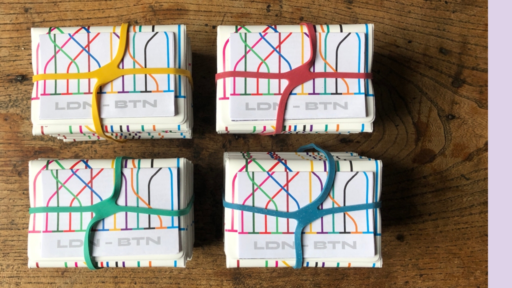
3) I would also have taken more time to consider how the 12 wallets are held together. For transport and presentation I am using rubber ‘X-bands’ (pictured here), which actually look great, but potentially a nice belly-band or box would have been even more impressive, given more time (and money!)

The next blog will show some much more detailed and lovely photographic documentation of the final project!

Designing the tickets

One of the first decisions I wanted to make as I started to design the tickets was what typefaces to use. The tickets would doubtless be very diverse in terms of content, so choosing a solid set of ‘brand’ typefaces would help to unify them.

First, I wanted to find a versatile, clear body typeface that would be legible at small sizes, and would echo roughly the typefaces used on the back of train tickets (as this was where the majority of my ‘body’ copy would sit).

Based on all the tickets I looked at, this would need to be a sans serif typeface. I considered a number of options, eventually selecting Acumin Variable Concept, in its regular weight. Part of the reason I chose this typeface was because it also offered more condensed versions, which I thought may come in handy. Also, it felt like one of the best fits based on the tickets I saw. 

Next, I wanted to choose my ‘accent’ typeface. I needed to decide whether I was again going to reference the kinds of typefaces used on tickets, or whether I was going to pick something different which still struck the right mood for me.

I looked at a number of typefaces that all, to my mind, in some way evoked notions of train tickets, train stations, or travel. 

Train tickets themselves actually vary depending on the type of machine they come out of, and weren’t nearly as standardised as I’d expected, which made me rule out a very literal choice like ‘ticketing’. 

In the end I opted for Syne. I had already been enjoying working with it on another project, and very much enjoy its slightly challenging but bold form-factor in its ‘extrabold’ weight, as well as the versatility offered by its lighter weights. It felt like a suitably striking choice to accompany my relatively simple body font. 

My next stage was to determine the colours I would work with. 

My original plan was to riso print the tickets, which led to a couple of major design decisions right from the get-go:

1) The tickets would each individually be single colour (though multiple colour prints are possible in riso, this greatly adds to the complexity of the process)

2) I would be limited by the ink colours I could access at LCC.

With this in mind, I decided to use these limitations to my advantage, by assigning each theme across my ticket set a specific colour. Where possible I tried to tie the themes in with the colour selected.

I then proceeded to design the 144 tickets on this basis. 

Though the tickets come in a number of formats (see page 38), I was still imagining the tickets as having a main, ticket sized ‘front’ and a ‘back’. (Some would then fold out to reveal further content inside)

This page shows 12 of my favourite ‘fronts’, and a diversity of approaches taken in designing them. I had decided the theme and ideas to be discussed in each ticket beforehand in my master spreadsheet, and then needed to come up with a way of conveying that visually.

They include illustrations by me, photography (by me, and shared with me by my fellow walkers and others interested in my project), quotes (some from my fellow walkers, some from relevant texts), found objects, collaborative textile pieces (with my first walking companion’s assistance), QR code links out to soundscapes, diagrams, infographics, and more.

I viewed the ticket reverses as a functional space, to explain and expand upon the content on the front (and in the case of fold-out tickets, inside).

I wanted them to echo the reverse of real tickets, so on almost all of them I included a non-functional imitation of the magnetic strip bar found on all UK train tickets, as well as predominantly using Acumin Sans, my body font chosen to echo the reverses of real tickets. I chose to use a point size slightly larger than that used on real tickets though, as many people complain about the legibility of such ‘small print’, and I wanted these tickets to be enjoyable to browse and read, and not cause eye fatigue.

This page shows a number of reverse designs from across the whole set.

A number of tickets benefited from research into other practitioners work. 

One of the ones I looked most in depth at were the textile tickets I worked on with Heidi from walk 1. We were keen to explore other examples of textiles being used as part of creative and critical cartography projects, to see what might be possible for us. Of course the scale of our works were much smaller than any of these, but it was still great to see what’s out there and take inspiration.

For our final outcome, Heidi embellished textile printed versions of photographs I had taken on our walk, based on themes and concepts we had discussed together. 

As mentioned, I wanted to be adventurous with format across the tickets, and make sure the format best fitted the content I wanted to convey, so I ended up with 4 main ‘styles’ of ticket.

1. Regular tickets — just a front and back, single piece of card.

2. 3x folded ‘maps’ — for each of the 12 walks, I decided that the first ticket would consistently be a fold out ‘map’, documenting the details of the walk (date, length, who with etc), and with some kind of cartographic representation (no matter how abstract) of the route inside.

3. ‘Zines’ — saddle-stitched multi-page booklets in a landscape format to match the ticket size. These varied from 8 right through to 24 pages.

4. Other fold outs — Some were simply double height tickets folded in half, others folded in half then in half again, and others still more adventurous concertina formats, up to a maximum width/length of A3 (a limitation put in place by my original plan to riso print)

As part of my personal practice I have been making and collecting zines for a number of years. I have generally always worked at A6 or A5 scale, but have always enjoyed seeing examples of other people’s zines at smaller sizes. 

All the zines in this picture are from my collection, and are below A6 in size. 

They explore a wide range of different topics, but what they all have in common is a certain requirement for conciseness, and many of them use this format to dictate their content. For example, in ‘Five Horror Stories’ (by James Burt, who is one of my walking companions), he takes the small format as a challenge to write incredibly evocative horror stories in as few words as possible. 

Other zines here play with format in even more adventurous ways using folding and cutting to convey their ideas in different ways. 

I am embracing the zine format for a few of my tickets, as a way of saying more than I could on one individual piece of paper’s front and back, but still keeping my words mindfully short.

I consider the whole body of work in this project to be a cartographic outcome, as it documents and explores a specific, geographically placed route in a wide range of different visual ways.

But I was keen for my project to remain rooted in some more traditional aspects of mapmaking and wayfinding, and wanted to make sure that each of my 12 walks had a slightly more literal ‘map’, as well as its other 11 tickets which explored the section of route in slightly more abstract ways. 

While some of these maps couldn’t be followed super precisely, they all offer a general sense of the route walked, and attempt to explore each section of the route in creative and thematically relevant way. 

Though each ticket is unique, there ended up being a few recurring design choices across the set, which help unify certain themes more clearly to the reader.

The most prominent of these is probably the tickets which link out to soundscapes. These are all black — their theme colour — and feature a halftoned photograph of the place that the soundscape depicts. This light blurring of the image is intended to be a visual signifier that these tickets focus on an audio experience rather than a visual one. 

Another recurring theme is that all the covers of the ‘zine’/booklet tickets are styled in the same way, so that it should be loosely clear at a glance which tickets expand in this way. 

Finally of course, all the fold out map tickets resemble train tickets — these offer a clear visual lead in to each walk, summarising the route, who came with me and what theme was at the forefront of our minds on that walk. 

One of the most influential figures on my practice over the years has been American visual artist Margaret Huber. As a tutor at the University of Brighton, she ran a module on the ‘visual diary’ on my undergraduate degree, which ultimately led to my own near-decade and counting of practice in this area. 

One of the biggest things she taught me in my illustration work was not to strive for perfection, and instead to focus on documentation and memory (in the knowledge that actually, frequency of practice improves skill and ultimately gets one closer to perfection, whether that’s the goal or not).

One long-running project of hers was titled ‘Day Return to Brighton’, in which she created an illustration every day on her tube ticket, while on the train down to Brighton for work.

In her own way, she documented her life, ideas and experiences of the same journey which I am now studying in such depth, and at the same scale/format as I am. I find this very pleasing!

I was keen to work with illustration as much as possible in this project, as it’s one of the areas of my practice I most enjoy and value, and offers ways of storytelling beyond what’s possible with the realism of photography or the abstraction of words.

I enjoyed pushing myself to work in ways that both depicted accurate truth and conveyed truths beyond what could be expressed in photography. 

For example, in the top left image, taking a plaque which — when photographed, was shadowed and overgrown by buddleia leaves, and representing it in a way that actually made it visible and clear. 

In other situations, using illustrations for the purposes of metaphor or in the creation of diagrams, or to augment photos, offered valuable additional context to ideas.

With my tickets designed, it was time to think about actually getting them into production!

Making a plan

Initial side note: time has obviously passed! For the final three months of my MA, I was so preoccupied with actually getting the work done, that I failed to update this blog. However, I am now making the time to do so, because I feel like I want to use this blog as a space to explore where my research goes next, and so leaving the documentation of my final project incomplete wouldn’t really be to do that justice. Now outside the bounds of academic documentation and pressures, I am looking forwards to hopefully using this as a space to explore my thoughts in a slightly more freeform (though hopefully still productive!) manner.

The images which illustrate these blogs are pages from my final submission portfolio.

To recap somewhat, I had originally intended to use my 12 individual walks along the London to Brighton Railway line to create 12 individual final outcome pieces, in a variety of different formats, each able (albeit loosely) to be considered ‘cartography’. These pieces would explore the past, present and future of the London to Brighton railway route, plus more broadly, the place that public transit (trains, specifically) holds in our society.

However, it was around walk 6 that I realised this original vision wasn’t going to work quite as I had hoped. Having completed the first 6 walks, I had loosely decided on: Walk 1 — textile map, Walk 2 — set of faux retro posters about leisure, Walk 3 — map poster, Walk 4 — zine, Walk 5 — video game, Walk 6 — board game… 

But this wasn’t feeling like a coherent approach. I had trusted that my voice as the creator would tie these pieces together, but it was increasingly feeling like it simply wouldn’t… And that I was biting off much more than I could chew in my ambitions!

Initial sketches of my vague outcome ideas

On my sixth walk, I talked about some of my format concerns with my walking companion Sarah Cole. She had seen documentation of the WIP show, and we got talking more about the idea of tickets. Tickets as ephemeral artefact, as beloved keepsake, as crucial admission pass, or even as dated relic of a changing system. It felt like an interesting scale to explore — compact and light but also capable of conveying enough information to get the traveller from A to B. Handheld. Precious but also fleeting. My feeling was that it could be a fascinating scale to create at, in a more cohesive and coherent manner than my previous ideas, and which is both easily distributable, and aesthetically striking, particularly when viewed en masse.

I have always been drawn to art in multiples. To a rich array of small pieces which together tell a larger story. This outcome would offer a chance to easily share and disseminate these tiny cartographic stories, snippets, moments, anecdotes, and more. They could potentially be viewed in sets, offering an almost zine-like format, while each ‘ticket’ also stands alone as a small fragment of the journey, and of a moment in time and place.

When thinking about the notion of smaller formats and many multiples, a couple of different projects sprung to mind.

First was Stefanie Posavec and Giorgia Lupi’s ‘Dear Data’ project, in which the designers sent postcards back and forth to one-another with hand-drawn data visualisations around agreed themes. Their style and execution has long been a great inspiration to me. 

When thinking about the specific area I’m going to be exploring — a section of the south of the UK that will doubtless have many highlights, but also many areas of extreme mundanity, I was reminded of Martin Parr’s curation of the ‘Boring postcards’ project. He gathered hundreds of examples of postcards from the last century in the UK, showing what would be, to many eyes, extremely unremarkable scenes. 

I am so interested in these kinds of places, what makes them worthy of documentation, and the small format of the postcard makes this feel especially relevant. (These postcards also heavily inspired my WIP show outcome).

I also thought of other projects where forms of provocation have been offered in the format of individual cards.

‘Oblique strategies’ is an iconic deck of cards by Brian Eno and Peter Schmidt. First written in 1975, each features a simple prompt, aimed at inspiring new avenues to creativity. The format enables them to be viewed easily individually, but also browsed through as a deck. In my final outcome there are many instances where I use the tickets as a space to ask questions or pose prompts to the reader.

Secondly, Superflux Studio’s ‘Instant Archetypes’ project. Described by them as ‘A toolkit to imagine plural futures’, the illustrated deck is loosely based on Tarot cards, but is intended as ‘a toolkit for anyone looking to open up possibilities, surface questions and untangle stubborn challenges’. The cards are intended as a creative tool for practicing speculative futuring in new ways. Again, their format allows more freedom to browse and consider them both individually and collectively than a bound or otherwise singular piece would. It is interesting to consider how viewing my final outcome in different orders affects the way it is read.

So from there onwards, I started thinking in terms of tickets. I settled on creating 12 tickets per walk, as it felt like a manageable but also worthwhile number of outcomes for each section. The idea of 12 x 12 (12 walks, 12 tickets per walk) also pleased me.

I went back through each walk I’d already done and thought about the ideas I’d like to represent and how I might do that, and for each subsequent walk, I was able to think in that way as I went. 

I also created a spreadsheet which helped me keep a grip on what I was doing.

By the end of my walks, I had a full plan for what I needed to create, the next step would be realising this vision…

Walk 9: Balcombe to Haywards Heath

Where: Balcombe to Haywards Heath

Date: 24/7/21 RESCHEDULED to 19/9/21

With who: Michael Snodden, Lucy McGrath, Lyall McCarthy

Who are Michael, Lucy and Lyall: Michael, Lucy and Lyall are my three closest friends from my undergraduate degree in Graphic Design at the University of Brighton. We all graduated in 2010, meaning we’ve all been working for over a decade, and we have all (apart from my three year sojourn to Yorkshire) remained in the London/Brighton area. Michael is a corporate graphic designer working for a Lloyds bank in the city. Lucy runs her own business ‘Marmor Paperie’ as one of the last remaining marbling craftspeople in the UK — running classes and producing high-end marbled papers for clients like Harvey Nichols and various publishers. Lyall works for the studio ‘Sensible Object’ (now owned by Niantic), best known for the hybrid digital/tabletop game ‘Beasts of Balance’. 

Why did you invite Michael Lucy and Lyall:  I am interested to think about the experience of creative careers between the cities of London and Brighton. Both cities are reknowned as creative hubs, and all four of us love Brighton very much, but somehow have all ended up in London. Is this the natural drift? Is it an inevitability? Why do both of these creative, exciting cities come at such a financial cost to those who choose to, or have to, live in them? How are these two cities tied together in creativity, and what have been our shared experiences of life between them over the last decade since we all graduated from Brighton University? 

Ideas shared en route

I invited Michael, Lucy and Lyall, my old university friends from the University of Brighton’s BA Hons Graphic Design and Illustration courses, because I wanted to explore where we’ve all ended up, and how our collective creative start in Brighton acted as a springboard (or not) for our creative careers. As we talked, it was interesting to affirm that we all share a collective bitterness towards our undergrad experiences at the University of Brighton, and the sense that our studies, tutors and experiences there, despite the prestigiousness of our two courses, did not prepare us appropriately for our professional lives beyond our degree. We all left feeling quite lost, and all of us have, to some extent, taken a few years to find our feet as creatives. 

After graduation, I was the only one of the four of us to stay in Brighton. None of us immediately got jobs, but Lucy and Lyall are both from London originally, so were able to return there and live with their families rent free, which I think they both appreciated, as it offered them a valuable foot in the door when attempting to secure London based jobs. (Especially those with lower pay). Michael returned home to Basingstoke, but as Basingstoke is an easy commute to London, he too was able to look for work there. I wanted to get to London, but couldn’t afford it without a job. I clung onto my flat in Brighton for as long as I could, as I felt that leaving the south and returning to family in North Wales would be the end of my career potential. All of us felt tied to London and Brighton professionally (though also emotionally, no doubt).

We all secured work within a year or so of graduating, though none of us went into the sorts of roles that our degree encouraged us to aspire to. Lyall perhaps got closest to his own dream from the start, securing a role as a graphic designer and illustrator at a small games studio. Lucy ended up working as the studio assistant for an artist (alongside a retail role in a gallery shop), Michael got a role as an artworker for Bank of America, and I eventually secured a position as a junior in-house designer for an education company. All of these starting roles ultimately played a huge part in shaping our careers ten years on, and reflecting on this together was really rewarding. 

Ten years on, the second small indie games studio Lyall worked for were bought out by Niantic, so he now works for the famous games developer, and broadly enjoys it there. Michael is now a Senior Designer in the banking industry (though now at Lloyds, not Bank Of America). Lucy remained in the studio assistant role for a few years, then discovered the dying craft of paper marbling, and branched out on her own. She now owns and runs ‘Marmor Paperie’, one of the last remaining marbling studios in the country, where she sells her high end marbled papers to clients like Fortnum and Mason, and Harrods. I remained in my role at the education company for ten years, only quitting a month or two ago. Over the last 5 years, I gradually phased down my days there, and phrased up my freelance work, relocating to Yorkshire for three years to make that transition viable. 

Michael asked us whether we thought our old, undergraduate selves would be proud of where we’re at now. I feel that decade ago Emma would be slightly disappointed at much of the work I’ve done over the past decade, and maybe that I stayed in the same role for so long, but proud of the life I’ve lived outside of work (which technically was enabled by my professional choices), and that I have been able to pay the rent by doing creative work. Michael felt similarly — he didn’t want to work at a bank so would probably be disappointed and angry with himself for staying so long, but would be proud of how much he’s grown, the job security he’s had, the professionalism he’s gained, and crucially, how much he’s been able to enjoy life. Lyall thought that old him would probably be quite pleased with himself! Lucy felt that old her would be very surprised by where she’s ended up, but pleased and proud that she’s probably had the best outcome she could have hoped for.

At university in Brighton, All of us were encouraged to aspire to prestigious agency roles, and though me and Michael clung onto that dream for a long time, ultimately all of us have realised that it’s not what we want from our careers, and that we can find more creative and practical fulfillment from other ways of working. Michael and I have valued the growth in technical skill and professionalism, as well as the variety of work that an in-house role can bring. (Our tutors told us that if we took on in-house roles we’d be stuck in them for the rest of our career – maybe true, but so what?) Lyall has hugely enjoyed working in a small games development studio creating concept art (which was a little looked down upon by our tutors). Lucy and I have both enjoyed the adventure of ‘going it alone’ in our different ways, which seemed like it was never even really discussed as an option at university. 

In terms of the connection between London and Brighton, I still feel very tied to the two cities (given that I spent the best part of a decade working in Brighton and only eventually moved to London at the end of 2019). For Michael, Lucy and Lyall however, Brighton is more of a place of nostalgia and (mostly) fond memories, and not so much a meaningful part of their lives any more. Michael commented that Brighton feels like his past — going there brings up the feelings of hope and ambition from his time studying there, but also some sense of ‘I didn’t make it how Brighton-me I thought I would’. But life in London is his present, and his future. It’s not a place of memories but a place of now, and doing, and experiencing, and growing.

As mentioned, none of us felt particularly supported at university, but after leaving, we all found ourselves in even more of a ‘void’ of advice. We discussed how fortunate we have all felt to have had some kind of ‘mentor’ in our professional lives — for me, it was my senior designer James, who nurtured, inspired, and techncially educated me more than anyone else, and who is still my right-hand man a decade on. For Lucy, it was the artist she studio managed for. For Lyall, his studio-mates at the games company he first worked at. For Michael, it was his uncle, who helped secure him his first role at the bank where he also worked, and who worked alongside him and taught him lots of valuable lessons when he was just starting out. I hope that one day I could provide similar support to someone else like me, who so desperately needed it at the start of my career.

We all really enjoyed walking through a piece of managed forest land adjacent to the railway lines. The tall pine trees left a soft, sweet smell in the air, and their needles were quiet and squashy underfoot. The lack of undergrowth made passing between the trees easy, and somehow the space had a feeling of simultaneous majesty and intimacy. I enjoyed reading about managed forestry in James C. Scott’s ‘Seeing Like a State’, and how the history of this practice, introduced at the start of the book, is then used throughout as a comparison for other ways in which ‘certain schemes to improve the human condition have failed’. Forestry management has come a long way since its earliest attempts, and though perhaps still environmentally problematic in some respects, this area felt well-managed and thriving with life beyond the trees themselves.

As we walked along a slightly unpleasant piece of road with no pavements, I saw a collection of buildings up ahead, and said ‘Oh, I think we’re coming to a place’. Michael probed this a little further, and I asked him the question — what is a place? He rather boldly claimed that a place is either here or there. Where you’re coming from or where you’re going to. ‘Can’t there be places in between?’ I asked… Only if you’re interested in them, he responded. Is this what defines place? One’s interest in it? These houses on this rural country road — a ‘place’ to their owners, driving home to them, but to us as we pass through, a liminal ‘non-place’, buildings which might as well be the CGI renderings of a computer game, locked off with non-existant, unprogrammed innards. 

In thinking about tickets as ephemeral artefacts in time and place, we discussed the experience of emptying out the pockets of a long-unworn garment, or old bag, and finding objects which create almost a mini-time-capsule of another life. This has been particularly resonant since the pandemic, during which our lives have changed so much. I recall, with vivid clarity, the experience of putting on a winter coat in around December 2020 (not worn since around February 2019), and breaking down in tears as I emptied its capacious pockets. They contained a couple of dog poo bags (my dog had recently passed away), a train ticket from a visit to my best friends’ in York (not seen since pre-pandemic), a chocolate bar wrapper from an American brand, bought in Boston (a trip made in Jan 2020), a small pebble from Brighton beach, and a crumpled receipt for dinner at my favourite restaurant (since closed for good due to COVID). These kinds of artefacts, combined, are tangible personal stories.

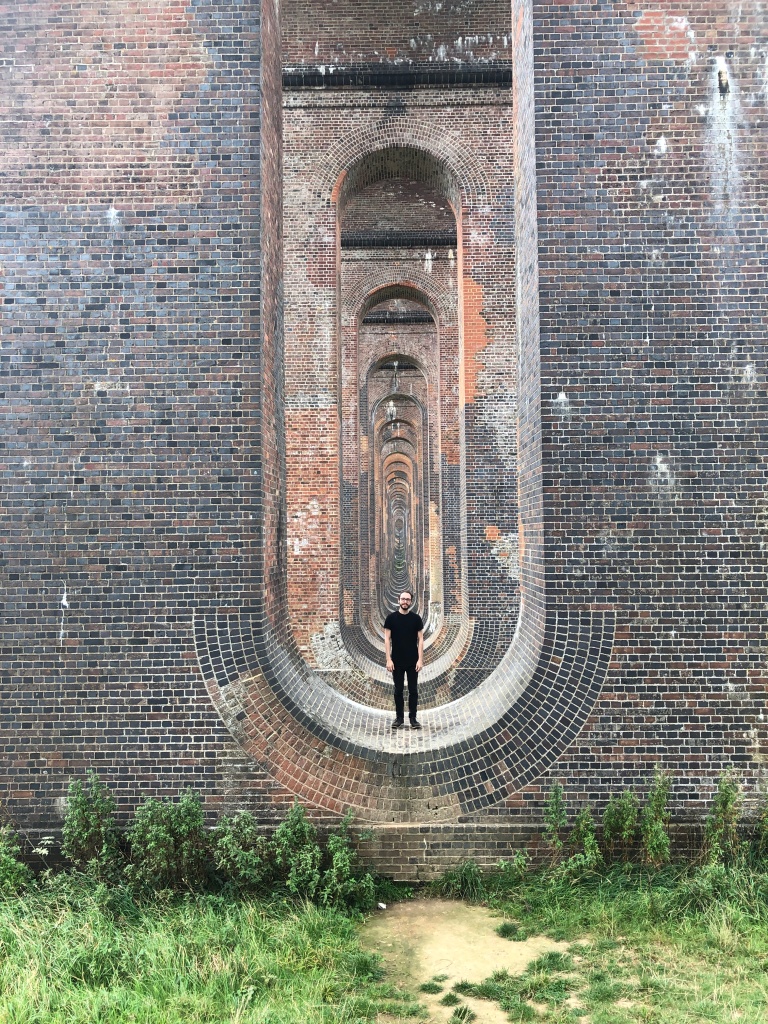
Of course, we paused for some time at the stunning Ouse Valley viaduct, to draw, take photos, and rest. Along the whole London to Brighton route, this is perhaps the most visually striking piece of railway infrastructure, and many other people came and went as we sat there, posing and taking photos within its stunning arches. This kind of pure joy and appreciation for a piece of railway architecture just makes me think about how valuable it can be to build structures which please, as well as those which function. 

This walk completely concludes my London to Brighton walks, what remains is to shape all of these collected stories, facts, memories and ideas into something approaching a meaningful designed outcome. More soon!

Walk 12: Hassocks to Brighton

Where: Hassocks to Brighton

With who: James Burt

Date: 14/8/21

Who is James: James is a writer and computer programmer who has lived in Brighton for over 15 years. He has written several short fiction titles, many of which focus on walking and hiking, such as ‘Thatcher in the Rye: Hiking and Brexit’. He is currently in the process of writing a series of short fictions about the South Downs. (And has a seemingly unlimited stash of South Downs trivia, history and facts stored in his brain). He also teaches at, and runs a number of creative writing workshops in Brighton and beyond. He is currently in the process of relocating from Hove to Hebden Bridge in West Yorkshire.

Why did you invite James: I love James’ South Downs fictions series, and knew from the very start that he would be the perfect person to invite on this section of the route. He knows a huge amount of South Downs related trivia and history, including facts about the railway route which runs through it, and he has incorporated these ideas into his stories. I am also interested in exploring storytelling as a methodology in my research, and felt that James would be the perfect person to bounce around these ideas with, and maybe collaborate. He is particularly interested in very short fiction, and is a regular contributor to Fifty Word Stories. I think this approach is interesting given the small scale I am working at.

Ideas shared en route

As we set off from Hassocks, we started talking about hiking, the countryside, and land access. It’s interesting (and positive) to consider how historic rights of way are still legally respected. That said, we encountered more than one footpath on the route that was so overgrown as to be impassible. While this could be straightforward neglect, lack of maintenance can also be intentional blockade. Whose responsibility are footpaths? I believe maintenance falls to the landowner, and while an entity like Gatwick airport will abide by the letter of the law (no more, no less), individual farmers may not be so fastidious. We saw lots of signs for ‘The Monday Club’, who are a local team of voluntary footpath maintainers (whose presence I’ve also seen on other sections).

James has recently been thinking a lot about ley lines. For as long as I’ve known him he’s been fascinated by myth, legend and the occult, viewed from the perspective of a cynical but respectful outsider. He has created an algorithm to create personally significant ley lines, like one which connects his old place of work, house, a couple of favourite pubs, a friend’s house, and more. We talked more about the historic significance of ley lines and their origins (ley lines are lines drawn on a map connecting significant historic landmarks of roughly the same era, which supposedly have power flowing along them). James said he’d thought about creating all sorts of ley lines, like one of public toilets, which I liked the idea of. (A line of powerful public service provision).

James introduced me to the concept of ‘champing’ — church camping. Some open minded churches along popular walking routes (especially those under-provided for in terms of accommodation) have recognised that they could offer a greater welcome (and maybe make a little money) by letting guests stay in their (otherwise vacant) buildings overnight. On our walk we paused in Pyecombe church, which, with funding from the South Downs National Park Authority, left their kitchen and toilet (and church) open during the day for weary hikers to refresh themselves. We certainly appreciated the generosity of their welcome, and it made me wonder more about what it takes for this to be viable.

Again the theme of ‘queering’ spaces came up. I talked about how I’d originally thought that queering spaces had to mean changing them, but actually perhaps one can queer a space simply by being visibly queer within it. We had this discussion once again as we passed by a golf club on the downs. I was considering whether one could queer golf by participating (though all I really want to do is smash the golf-system), and James pointed out that golf is as much about the club as it is about the game. I don’t object to private clubs as long as they keep out of my way, but golf takes up such huge swathes of the countryside, it is kind of grotesque that it carries with it such an exclusive culture. (That depending on the club could make people feel unwelcome for a huge array of reasons, including race, class, gender, sexuality and more)

We talked about the importance of carving out spaces for adventure in mundane day-to-day life (particularly mid pandemic). While some amount of routine is important to most people, having absolutely no escape from routine, even during leisure time, can leave many people feeling empty and deeply unhappy. Walking/hiking have always been a free, mostly accessible way of having an ‘adventure’, but nonetheless, a proper countryside hike is not accessible to all due to the costs and challenges associated with getting out of the city. What this whole experience has shown me is that, with the right mindset, it’s possible to have a mini adventure even within just a few miles of home. How could I help foster this curiosity and passion for urban (and rural) exploration in others? 

We talked a big about the Duke of Edinburgh’s award, and how, for some (me!) its pressures and trials put them off hiking and camping for life. The Duke of Edinburgh’s award is supposed to foster resilience and motivation and a drive to succeed, but in me it merely fostered an even deeper loathing of the countryside, and a firm goal to absolutely never camp again in my life. I have absolutely no sense that a desire to camp is something we need to foster in anyone, BUT, wouldn’t it be nice to teach our kids that a walk in the countryside can just be a fun, chill, social, interesting experience, rather than some bleak test of endurance and team building? 

As we reached the A23, we discussed hostile spaces — or specifically, spaces and places which are hostile to pedestrians. As we struggled to find a route across the dual carriageway, I was struck by the largeness and inhuman scale of everything, from the width of the roads to the huge signage. These are spaces designed for speed, for machines, and they do not offer a welcome to humans outside of these machines. Of course, the same could be said of the railways, but roads have always felt like a bigger affront because of their proliferation and the feeling of individualism, rather than that of collectivism that trains offer. 

We talked about leaving Brighton. I lived there for nearly a decade, and James has lived there for over 20 years. I left in late 2016, James left just a couple of years ago. Unlike me (I left to please a partner), James is ready to go on his own terms. He feels the need to break out of old habits and social patterns, and forge a new life for himself in a new community as he enters his mid 40s. He suggested that perhaps Brighton doesn’t have anything for you if you’re not young or wealthy. It was food for thought indeed, because (as I also discussed with Jade), it does feel like long term happiness in Brighton could only be possible with wealth. I sometimes think of returning to Brighton, but I have to ask what kind of life I could actually lead there on unstable income. 

James mentioned that returning to Brighton after a couple of months away he felt nothing — he had expected to feel big emotions. I said I’d had the same experience when I first moved to Hebden Bridge and returned within a few months. It felt like I hadn’t even been away. But when I was gone for over 18 months during the pandemic (the longest time I’d been away since I moved there in 2007), I missed the place like a physical ache. The first time I returned in June this year I wept with emotion as I arrived. What breeds affection? Familiarity? Positive memory? A visceral combination of the two? Either way, Brighton is etched onto me for the rest of my life. James has an even longer history there than me, and we wonder whether, given a similar amount of time away, he will experience the same emotions and weight of memory on his return.

We talked about how much harder it is to get lost now than it was when we were growing up. Of course this is mostly a good thing — our devices keep us safe and situated at all times, and though of course we still lose our bearings or make errors at times, these are quickly understood and rectified. I recall an exercise I undertook in the summer holiday before my undergraduate degree started (2007), before I had a smart phone, where I was prompted to ‘get lost’ by a pre-uni brief, and I had my dad drop me and a friend at a random spot in the countryside as didn’t know, having had our eyes closed the entire journey. He came to pick us up once we managed to find a village. It was a fascinating and fun exercise and I slightly resent my own personal inability to switch off.

We talked a bit more about the history if wayfinding in travel, and James told me how the earliest lonely planet guide was only 96 pages long and advised on how to get from London to Australia. It was less about sights to see, and more about places en-route to find community and get the most up to date advice on border crossings, local food and other information that we would now use the internet for. I like this analogue approach to finding community and structure while travelling. About learning how to travel rather than where to travel. We also touched on psychogeograohy and how capitalist cities and capitalist city planning conventions give us an ‘instinctive’ sense of which routes we should follow to remain safe and not get lost — and these are often ‘the main drag’ where all the shops are situated.

On the subject of trains, James referred to ‘the east Croydon shuffle’ (his name for the strategy) where if the trains are in any way ‘fucked’ and you’re in London wanting to get to Brighton, you just want to try and get to east Croydon, because you have more options from there. East Croydon is another of the places along the route (like three bridges) that most brightonians rarely want to be and have often never left the train station, but are nonetheless intimately aquatinted with. James heartily agreed with Alex’s observations about how draining the commute is, and spoke with disdain about ‘well-meaning artists and placemakers staging interventions to try and make commuters talk to one another’.

And with that… My London to Brighton odyssey is (nearly) over (I still need to go back and do walk 9, which was postponed for COVID related reasons!)

Now, to figure out what’s next… More soon I hope!

Walk 11: Burgess Hill to Hassocks

Where: Burgess Hill to Hassocks

With who: Zoë Austin

Date: 8/8/21

Who is Zoë: Zoë is a graphic designer and illustrator who graduated from the BA Hons Illustration course at the University of Brighton the year after I graduated from BA Hons Graphic Design. Over the following decade she has worked as a graphic designer across a range of sectors, including Education, fintech, charity, agency work, and more. She has also freelanced for a wide range of clients. Since graduating she has held roles in both London and Brighton, and has lived in both London and Brighton, meaning she has done the commute in both directions for a number of years. Her current role is in Haywards Heath, and she now lives in Brighton, making this one of her easier commutes, and allowing her to get to know one of the locations along the route.

Why did you invite Zoë: As a graphic designer, I was interested in considering the role that design plays along the entire route, and wanted to invite someone who had also worked as a graphic designer in corporate settings for many years. Both Zoë and I are well aware of the demands of corporate/public service design, and the compromises that often end up being made. We’re also interested in the design vernacular of smaller communities and organisations, like those that will be encountered along this section of the route. It is unlikely we will encounter any ‘award-winning’ design as we travel, but what we will see is still worthy of discussion and consideration. 

Ideas explored en route

As I wait for Zoë to arrive at Burgess Hill station, I note, as I have done at many other points along the route, the prominent Samaritans advertising — both posters in advertising slots, and the smaller signs that sit at the far ends of platforms (as well as on railway bridges and as level crossings) offering a more direct call to action, if people are feeling desperate. Samaritans have been working with the UK’s railway network for possibly my entire life — I first remember seeing these signs on train stations and bridges as a child, and asking my mother what they were about. I now volunteer for the Samaritans as a call-handler, in part because of their connection with the railways, and the sad deaths that so often still occur across our network…

I think the Samaritans visual language and messaging is really interesting. Their current campaign is ‘Small Talk Saves Lives’, encouraging people to make conversation with anyone they see who doesn’t look alright. The majority of their poster slots are still taken up with their older ‘handwritten’ style campaign. As they are a charity and presumably the ad space is given to them for free or at a reduced rate as part of their partnership with Network Rail, there is perhaps less impetus and budget to swap out the campaigns more regularly. Ultimately, their message remains the same — we’re here if you need someone to talk to, or if you’re feeling suicidal — the challenge for their design team is coming up with creative new ways to say that.

When Zoë and her partner Dan arrived, we talked a little about Southern’s branding. Southern are one of the two main railways to run on this route, with their yellow and green colour scheme. We talked a little about the ‘vibe’ of this brand — we all agreed it’s distinctive, if a little old fashioned. Dan suggested is maybe harks back to an older era of design, the classic promotional railway posters of the early 20th century. Given that commuters in the south of England are (were?) a captive market, the main audience to whom trains might additionally be promoted is probably leisure travellers, so using this kind of lightly retro styling could be an intentional choice for that reason.

We also talked about the Southern logo and recurring station name motif (as photographed at Selhurst, South Croydon and other locations on my earlier walks) — the long rectangle with rounded ends, with another shorter rounded rectangle sitting behind it, emerging above and below the main section. The choice to commission these large scale murals in several locations is obviously part of this branding strategy. 

As well as their own branding, Southern also oversee the Gatwick Express brand. This brand is very different to Southern’s, and was recently (?) refreshed to reflect their brand new rolling stock. The Gatwick Express is, in normal times, the fastest way to get to Gatwick from central London, and runs a non-stopping service from Victoria. Like the Heathrow Express (though not quite as extortionate), the ticket prices are marked up accordingly, to make the most of the captive tourist market (who might not realise that regular trains also go to Gatwick and only take a few more minutes). This branding is bold and red — making this trains, and crucially, their in-station branding at Victoria — easy to find, in contrast to the more subtle brands of Southern and South Eastern trains that also run from that station.

Thameslink trains also run on this route (However, unlike the route I am focussing on, they travel from Brighton into Blackfriars and/or London Bridge, and pass through the capital, emerging at Kings Cross to proceed on up to Bedford and Cambridge). Again, they have recently received brand new rolling stock, and have rebranded accordingly. The company used to be known as ‘Thameslink’, then for a few years was ‘First Capital Connect’, and has recently reverted to Thameslink. A lot of people I knew never even stopped calling it Thameslink, so clearly they decided to work with the positive brand recognition they had, but refresh the brand to feel modern and contemporary. The trains are a simple white/light grey livery, with their minimal logo emblazoned on the side. Their new trains have been much maligned for their minimal interiors and uncomfortable, hard, ironing-board like seats, it almost feels like the branding fits the trains perhaps a little too well. 

Zoë told me that in one of her old jobs, she met the former head of design at Thameslink, who was interviewing for a role with her company. It seems that Thameslink had laid off all or most of their designers, and decided to use agencies to do the work. Of course I can know nothing of the detailed operational requirements, nor indeed whether they have retained some in-house capacity, but it got me thinking again about the huge amounts of designed materials that railway companies must produce every day, from timetables, to informational posters, to promotional posters, and so much more. I have often wanted to work in a role like this, and my feeling is that a strong in-house team is an infinitely better solution than an agency whose attentions and loyalties will inevitably be divided. 

Both Zoë and Dan were new to Burgess Hill and the surrounding area. We followed a quiet footpath through the heart of the town and out, and they commented on how peaceful it was. Post-pandemic, both of them had been thinking it might be nice to relocate somewhere more like this, somewhere quieter. The place they both loved the idea of was Balcombe, with its quaint village life and beautiful houses and scenery, however Balcombe is already priced beyond most people’s dreams for precisely those reasons. It was, however, important to both of them to remain on the mainline rail route, both for social and professional reasons. 

Dan commented that he felt everything may become ‘decentralised’ — meaning that there won’t, in fact, be a return to city office life in the way that there was pre pandemic, and that remote, distributed working will remain/become the norm. However, he did wonder whether this was wishful thinking, and that in fact we will drift back to the old ways. ‘A lot of Tories probably own all those big office buildings, and they’re going to have to figure out what to do next. Will they be converted into housing? Turned into something else? Or will there be increasing political pressure to refill them just like old times. Any change that comes of this will be determined by who’s in charge, and right now, it’s the same people in charge who were before.’

But regardless of what is to come in the future, both Zoë and Dan have been able to stop commuting over the past 18 months, and are valuing the time that this has claimed back in their lives. Zoë can’t drive, and Dan hasn’t driven in over a decade, so they are still reliant on trains and other public transport for their leisure, social and any remaining essential transport needs, but travelling by train now is more of a choice and less of an obligation than it once was. Despite their long and tiring commuting experience, both Zoë and Dan still love travelling by train, and seem to value the chance to make journeys in that way for leisure.

We talked more about living in the ‘in-between’ places along the route. Zoë said ‘Is it bad that I want to live in a retirement village now?!’ — she says that the pandemic has totally changed her mindset and priorities, and what she wants now are higher quality spaces (outdoor and indoor) of her own — she no longer prioritises the hustle and bustle of city life as she once did. Perhaps it would always have been that way at some point, but it has accelerated these hopes and dreams, for her and maybe a lot of others around our age. One of our favourite hobbies being ‘looking on rightmove at houses we can’t afford’.

We looked at a number of examples of what I would term ‘local’ or ‘small town’ design. I have long been intrigued by this almost ‘outsider’ design practice, which disobeys most of the formal rules of design, is often aesthetically displeasing to look at, but which nonetheless conveys a message, makes a point. Ever since there have been computers in almost every home, this design has existed, and it is not going anywhere. It both validates my existence as a designer (‘People can’t just do this work well, it takes years of training and practice and study and understanding’) and invalidates it (‘Regardless of my existence, people will produce this work anyway’).

(Honorary additional mention on this walk for Hassocks Pet Centre, a small, friendly local pet shop which Zoë suggested we divert to at the end of the walk, which contained MORE CATS THAN I HAVE EVER SEEN IN ONE PLACE BEFORE)